In a recent talk I tried to explain how Fourier Transforms can be used to estimate the frequency content of signals (ie. the spectral content). Normally we would use maths to illustrate these concepts - but that doesn't suit everyone, so here's an attempt with only animated images!
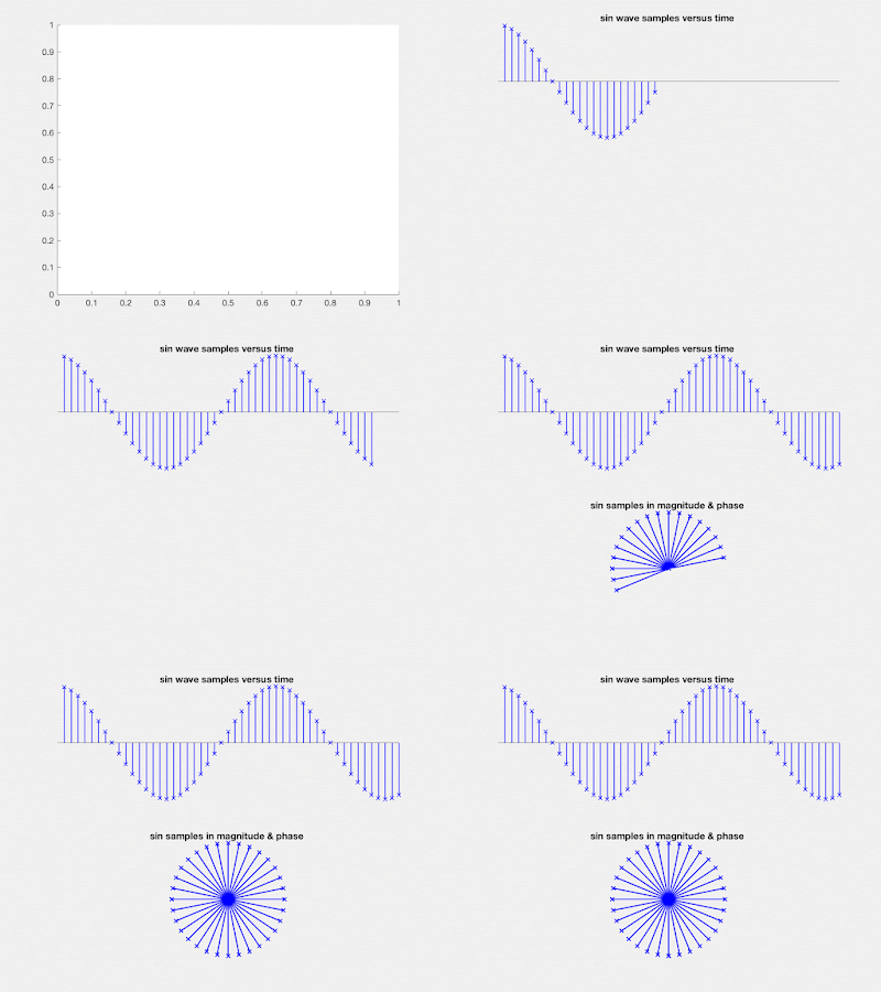
First let's consider a signal which contains only one frequency component. We consider sampled signals (i.e. discrete-time signals) - the upper plot on the left shows a sin wave sampled at regular time intervals. In fact any periodic signal can be decomposed into sinusoidal components but for simplicity we will only consider sin waves.

Since each sample has a magnitude and phase, in the lower left plot we show a polar version of the sample sequence. This rotating "phasor" signal is actually a more generic representation than plotting the samples versus time. The original signal can be recovered by taking the horizontal component of the polar diagram. Likewise the vertical part represents another sin-wave, with 90 degrees phase difference. (In radio models, these components are called the Inphase and Quadrature signals.)
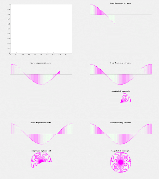
Of course if the signal frequency is lower, the plot will show more samples per cycle (see magenta example).
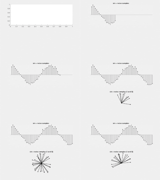
Noise has been added to the sin-wave shown on the LHS. (In the polar plot, independent noise samples have been added in both the I and Q dimensions.)
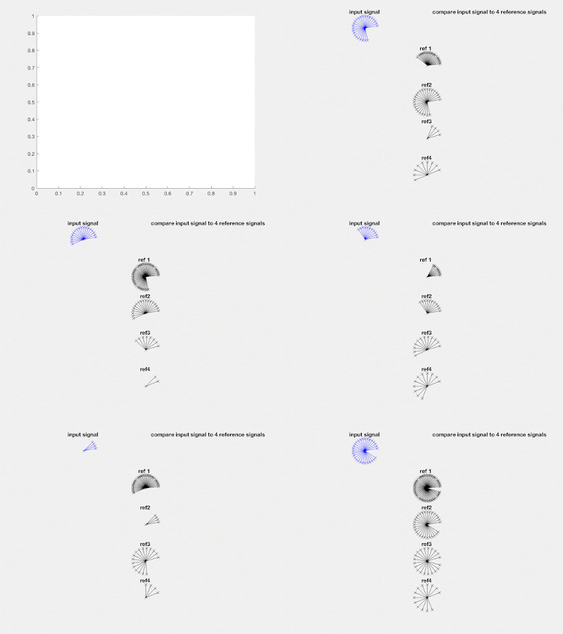
From now on we will drop the time-domain plots. Our aim is to estimate the amount of each sin-wave component in a sampled signal. Assume our input signal is shown in blue phasor samples and will be compared to 4 "references" plotted below in black. Ref2 is twice the frequency of Ref1, the next is three times etc. A Discrete Fourier Transform (DFT) would normally contain many more frequency references, but four is enough for this illustration.
You might notice that the blue input is the same frequency as Ref2. How can we use the reference phasors to estimate the input spectrum?
Assume that for each new sample, we multiply the signal magnitude by the reference magnitude (which is 1) and that we take the difference between their phases. This gives a product phasor for each new sample which will be added to the previous product (as in vector addition). The result is shown below, with the references shown in different colours for clarity.
On the RHS sub-plot, observe that the magenta phasor (or vector) sum grows steadily in length during the DFT. (The phase difference between blue and magenta is zero.) However the other product sums "curve back" on themselves and their net length is zero at the end of the DFT. The RHS sub-plots are autoscaling so we can see the initial behaviour more clearly. The bottom right sub-plot shows the net length of each phasor sum, during the DFT. This shows, in more conventional plotting style, that the spectral amplitude is zero for all components except Ref2.
If you have followed the figures above -- well done! But is this example too contrived - what happens with noise, or if the input signal is a slightly different frequency? On the right, we see it still works! Now the magenta vector sum is slightly curved - but its length is still much greater that the other components. (We say the input frequency is no longer 'bin-centred'.)
Needless to say, I encourage you to look at the mathematical description of DFTs. While the DFT takes a lot of numerical processing, thanks to the great work by Cooley and Tukey in the 1960's we now have the very efficient Fast Fourier Transform (FFT). This forms the basis of signal processing in many modern communications systems (and much else as well!)


